|
 |
 |
 |
![]()
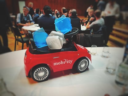
The numbers are impressive: Mobility, the leading Swiss carsharing provider, offers its 280’000 business and private customers 3’000 vehicles for any situation at 1’600 locations.
As a carsharing pioneer, Mobility mandated the development of the first mobile app in 2010. While it was well received in the market and a huge success, it was time for a complete makeover in 2023, as the digital world – and with it user expectations – had significantly changed over time.
Therefore, Mobility commissioned the Fachhochschule Graubünden to put its existing mobile app through its paces in order to identify potential for improvement. Three pain points were identified:
- Too many steps are required to book a vehicle
- Loading time is too long
- Design looks outdated to young users
This is where we, Adnovum’s UX team, entered the scene. Our mission: to develop a new vision for existing and – in particular – future Mobility app users under 30.
Spoiler alert: We were successful!
A holistic rejuvenation
From the outset it was clear to us that we needed to rebuild the mobile app from scratch to give it the fresh look and feel that would attract the younger generation. At the same time, it should be designed for easy use so that also non-digital natives would be encouraged to book online. To achieve this goal, we applied our proven and systematic human-centered design approach (HCD).
This is how we proceeded:
Collaborative journey mapping
We worked closely together with Mobility's experienced staff right from the start to carefully document every step of the customer interaction process – from finding a rental vehicle to returning it. In additional workshops, we delved deeper into these steps and involved further Mobility experts when required.

Crafting a fresh look
To create a refreshing appearance for the new app, we explored various approaches focusing on fonts to colors to shapes. Together with Mobility's decision-makers, we ultimately opted for an approach that seamlessly integrates with Mobility's existing design but appeals to a younger audience.

Designing the app structure in joint workshops
We developed the structure of the new app in several iterations in joint workshops with Mobility. Among other things, we sketched out rudimentary concepts in small groups and then presented them to the other participants. We quickly realized that the map would be the core element, showing the users the available vehicles as soon as they open the app.

User-centric testing and feedback
We first tested design concepts and implementations for simplicity, clarity, and functionality. This was done with the help of potential end-users under real conditions as well as via an integrated app feature. This feature allowed users to shake the app to directly report errors, suggest improvements, or make requests. Between the first release and the go-live, approx. 600+ reports were submitted, 50% of them being requests, 40% bugs, and 10% questions. This feedback helped us prioritize the next steps and fix minor flaws.

Transitioning to the new app
To ensure a smooth transition from the existing to the new app, we gradually made the app accessible to an increasing number of people. Initially, only a few Mobility employees had access to the new app. After several months, family and friends were also included.

|
«I generally have reservations about modern technology. I only used the Mobility app because my SwissPass card wasn't working and I was in a hurry. Michael Zuber-Steffen
|
|

Eliminating the pain points …
What specific changes were needed to avoid the pain points in the former app? In a nutshell:
Too many steps to book a vehicle
This issue was solved by an intuitive user flow guiding the user step by step. The map interface, combined with intelligent search and filtering functions, enables quick access to the desired vehicle.
Loading time is too long
Following an analysis of every process step and how it can be improved, we opted for native development (iOS and Android), an upgrade of the backend, and new APIs for optimal performance.
The idea here was to introduce not only a modern, but also timeless design. This required changes on multiple levels:
- Colors and shapes
Anthracite instead of black, fewer shades of red, upgraded color gradients, round shapes - Accessibility
Best possible readability of user interface, whether in underground parking or in the sun, and best possible operability, e.g., for parents carrying a baby in their arms - Icons and visuals
Icons with an easily recognizable style and understandable meaning, real pictures of cars instead of illustrations - Focus on U30
Modern and minimalistic design, U30s’ tone of voice

… and introducing experience-oriented mobility without speed bumps
In this project, we not only solved the problems with the former app but took user experience to an award-winning level by providing a few extra features:
Discovering Mobility without registration
Get to know the range of Mobility offerings – registration is only necessary upon actual vehicle booking.
Geared towards everyday situations
Whether a spontaneous tour or a planned excursion, various booking types are available – with numerous features such as quickly extending reservations by 30 minutes or comparing vehicles and their availability.
- Open and close the vehicle in the app via Bluetooth
- Refuel and charge with guidance and navigation to nearby stations
- Verification of driver's license
- Report and view damage

One for all and all for one
Ten months into the launch of the new app, Mobility reports a user growth of 3.4% or 1000 users compared to the previous year – across age groups. There is no better way to prove that it is possible to design an app that makes everyone happy: the younger generation, non-digital natives, and any other group. The key is close cooperation with the client, a user experience design that truly deserves its name, plus willingness to go the extra mile.